AUSTIN FOODS: BRANDING AND PACKAGING REDESIGN

Austin Foods & Beverages Pvt Ltd is a young and dynamic company which aspires to emerge as an industry leader in the field of sterilized foods in India.
Austin operates a canned foods production facility spread across 40,000 sq.m. in Anand, India, ensuring seamless supply and strict quality control. Austin takes pride in providing an extensive range of sterilized Pulses, Vegetables, Fruits, Ready to eat & Pastes.

Austin is a part of well diversified Avadh group having turnover of USD 150 million. Group is also engaged in contract farming for more than 20 years.
With certifications including FSSAI, BRC, HACCP, US FDA, and HALAL, and a production capacity of 3,60,000 cans per day using USFDA-approved European machinery, the brand maintains global standards.

To reimagine Austin’s visual language and packaging system to create a fun, modern, and cohesive brand identity that communicates farm fresh, natural, nutritious, healthy, flavourful, and quality assured food while remaining scalable across multiple SKUs and suitable for both B2B and B2C contexts.
Business to Business : (HORECA) Bulk buyers who require consistent quality and standardized taste across batches. They prioritize time saving products that improve operational efficiency.
Business to Consumer : Urban families and health conscious consumers seeking convenient, safe, and nutritious everyday food.
Austin’s previous packaging feels visually monotonous and locally styled, lacking the refinement expected from an established global brand. The designs do not effectively communicate scale, quality, or credibility, and the intended premium positioning is not reflected in the overall look and finish.
THE BRIEF:
The paste category comprising garlic paste, ginger paste, ginger-garlic paste, sauted onion paste, boiled onion paste, and dice sauted onion paste, represented one of Austin’s most diverse and commercially active product lines. The task was to design a label system for this entire paste range that would work across multiple pack sizes, communicate individual product character, and read as a coherent family on shelf. The rebrand supports the shift from a B2B supplier to a consumer focused brand. The current identity does not fully reflect its quality or relevance in today’s contemporary market. The new branding aims to communicate trust, modernity, and stronger market positioning.
No Visual Hierarchy
Brand name, product name, and supporting info competed equally. Consumers couldn't read the shelf in under a second.
Locally Styled Identity
The design language felt appropriate for a domestic supplier, insufficient for a brand exporting to 15+ countries.
No Premium Signal
Packaging didn't communicate the quality inside.

VISION
To expand globally and be recognized as a leading high-quality Indian food brand, offering greater variety to consumers worldwide.
TONE OF VOICE:
CONFIDENT
TRANSPARENT
POSITIVE
TRUSTWORTHY
MISSION
Our mission is to give happiness to every family through a variety of products that make dish easier to eat and cook.
HEX: #61BD5A R:97 G:189 B:90 C:49 M:0 Y:52 K:26
HEX: #008249 R:0 G:130 B:73 C:100 M:0 Y:44 K:49
HEX: #194F2D R:25 G:79 B:45 C:68 M:0 Y:43 K:69
1. Maintain the highest legal & ethical standards
2. act with integrity
3. care for the environment
4. professional approach
PURPOSE
To make authentic, convenient, and wholesome food accessible to families everywhere while maintaining trust, quality, and freshness.

QUALITY
We maintain uncompromising standards in ingredients, manufacturing, and food safety.
HONESTY
We operate with transparency and integrity in sourcing, production, and communication.
AUTHENTIC
We stay true to Indian flavors and heritage while meeting global expectations.
COMMUNITY
We aim to nourish families and build long-term relationships with customers and partners worldwide.


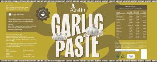


STAGE 1 BOLD LAYOUTS: Vibrant yellows, hot pinks, saturated oranges. Large, compressed typography pushed to visual limits. Testing how far design could go.
STAGE 2 MONOCHROME SHIFT:
Moved toward quieter, refined palettes. Ingredient-inspired monochromatic systems introduced, grounded, authentic, aligned with Austin values.
STAGE 3 TINTS & TONES: Multiple tints, shades, and tonal variations tested to achieve balance between visibility, hierarchy, and aesthetic appeal.
STAGE 4 Layout & Hierarchy: Image placement proportion, brand logo positioning, typographic hierarchy, and integration of certifications and recipe panels explored.
RECOMMENDED DIRECTION




HEX: #131519 R:0 G:0 B:0 C:24 M:16 Y:0 K:90
HEX: #FFFFFF R:255 G:255 B:255 C:0 M:0 Y:0 K:0
HEX: #6FACE9 R:111 G:172 B:233 C:52 M:26 Y:0 K:9

TYPOGRAPHY AS BRAND SIGNAL
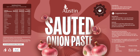
Kensington Compressed Black replaces generic typefaces. The product name is readable in under one second on shelf, commanding attention without visual noise.
MONOCHROMATIC COLOR CODING
Each product is assigned a base colour drawn from its ingredient palette. Tonal shifts distinguish size formats within the same product. The range reads as a family at distance, each product reads as individual up close.
REALISTIC PRODUCT IMAGERY
High-quality, realistic ingredient photography is embedded within the label. It communicates exactly what is inside, building appetite appeal and product trust simultaneously.
STRUCTURED LABELLING HIERARCHY
Front face: bold, consumer-facing. Back panel: nutritional data, certifications, recipe. Side panel: batch and contact info. Every zone has a defined purpose.
FINAL LABELS

PASTE SAMPLES
PRODUCT SAMPLING:
Distributed at food exhibitions, trade fairs, and HORECA events to allow buyers and consumers to test the product before committing to bulk or retail purchase.
COMPLEMENTARY GIFT:
Included in welcome kits, brand packages, and promotional mailers as a high quality branded touchpoint.
EXPORT SAMPLE KITS:
Sent to international distributors and private label buyers alongside the Austin brochure for initial product evaluation.
RECIPE CARDS & MEAL KITS:
Bundled alongside fresh ingredients and an Austin recipe card as a consumer engagement tool in premium retail contexts.

REMINDS YOU OF HOME...
BROCHURE DESIGN
IDEATIONS


FINAL DESIGN